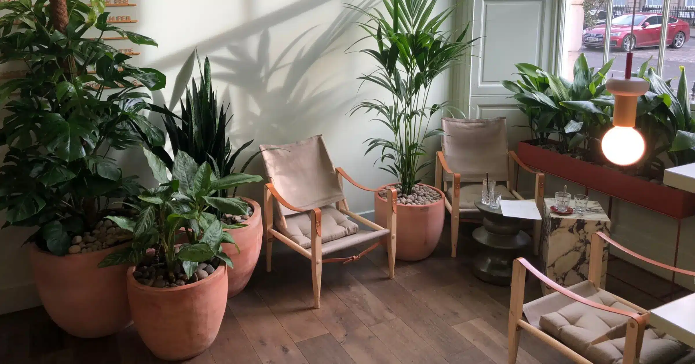
For years, the default commercial planter has been white, grey or black. It’s safe and it’s easy to specify. It also rarely adds anything to a space.
That’s starting to change. Designers are moving away from cool minimalism, and the planter is turning from a purely functional container into a design feature in its own right.
Across interiors, the mood has changed. Industry commentary on 2026 palettes describes a clear shift away from the cool minimalism that dominated the past decade, and one design studio notes that neutral palettes are moving from cool minimalism to warmer, inviting hues. Fit-out teams are applying the same thinking to the details, and planters are one of the easiest places to do it. homedesignsfmlink
Three colours keep coming up.
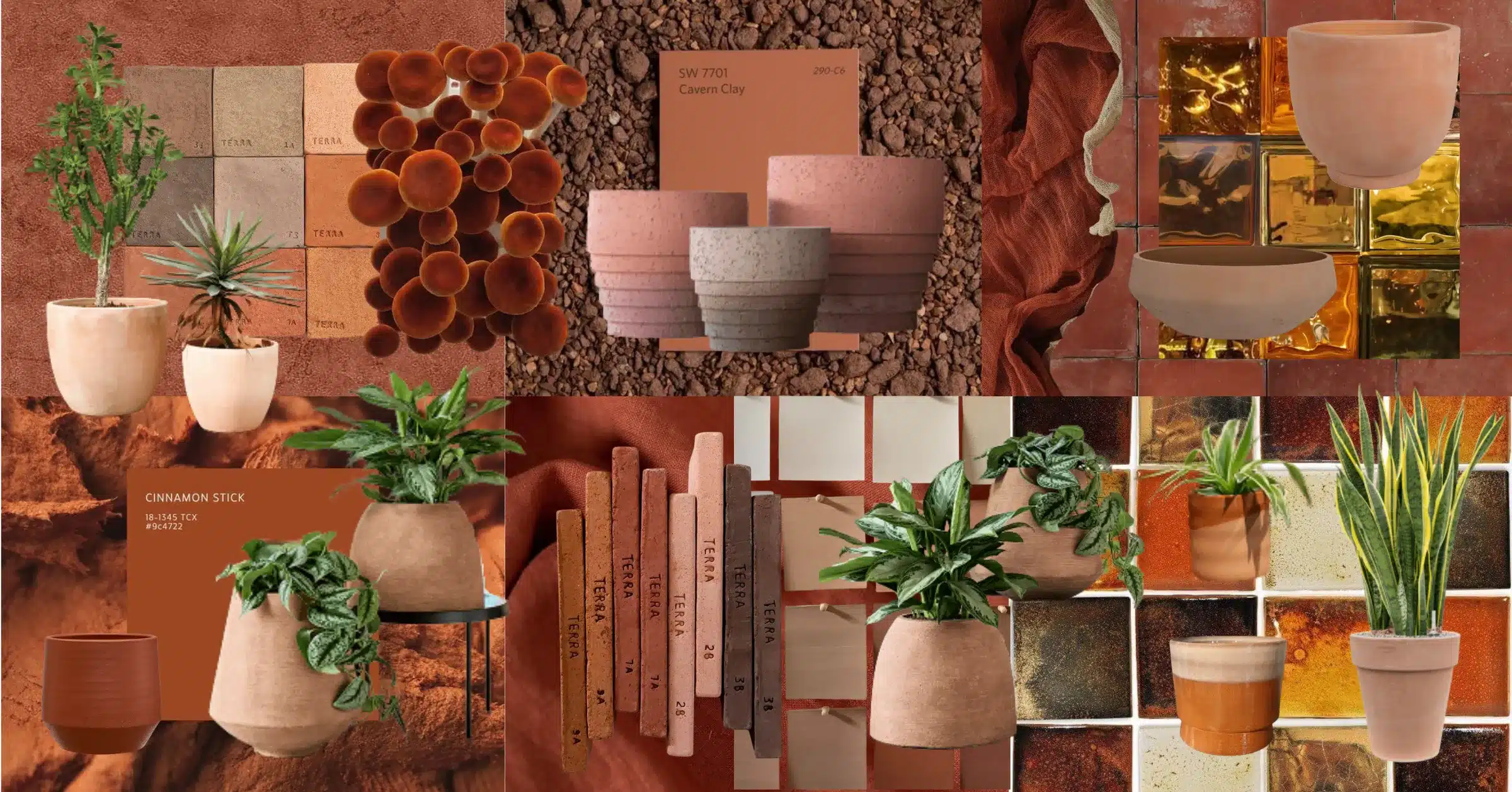
Warm, earthy tones are among the most prominent colours in current interior design, reflecting a return to authenticity and nature. A terracotta planter fits that mood naturally. It looks as if it belongs with the plants it holds, and it softens hard surfaces like glass, concrete and steel. krion
It works well in hospitality, where warmth sets the tone straight away. Think restaurant entrances, hotel lobbies and outdoor dining terraces. In offices, it takes the edge off open-plan floors and breakout areas that can feel clinical.
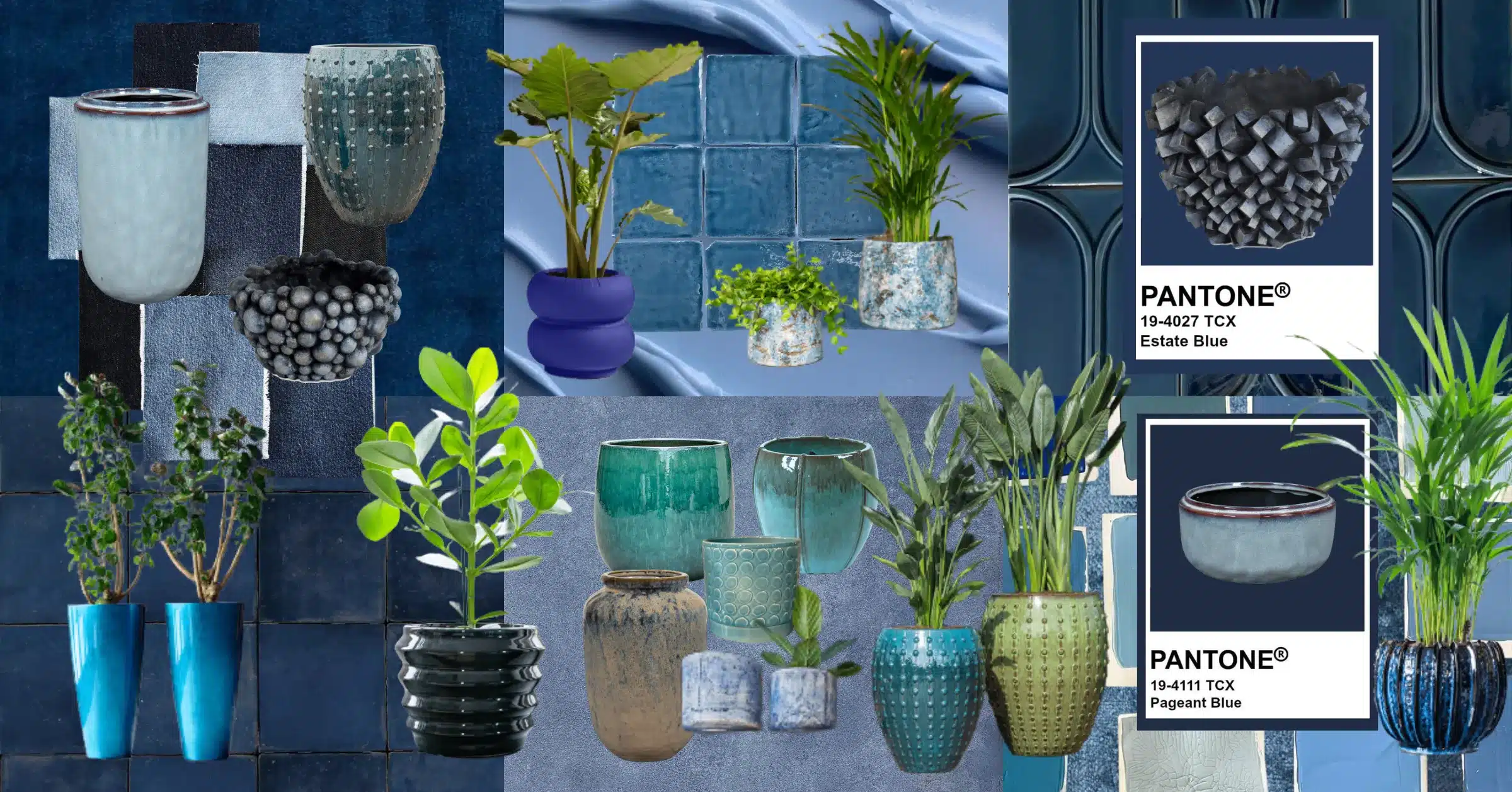
Bold blues are having a moment too. Cobalt in particular has been finding its way onto the catwalk, and that confidence is carrying into interiors.
A glazed cobalt planter is a statement piece. Against neutral walls or warm timber, one or two can anchor a reception area or give a corridor a focal point. Green foliage against a rich blue glaze also looks striking, and it’s an easy way to show some personality without repainting anything.
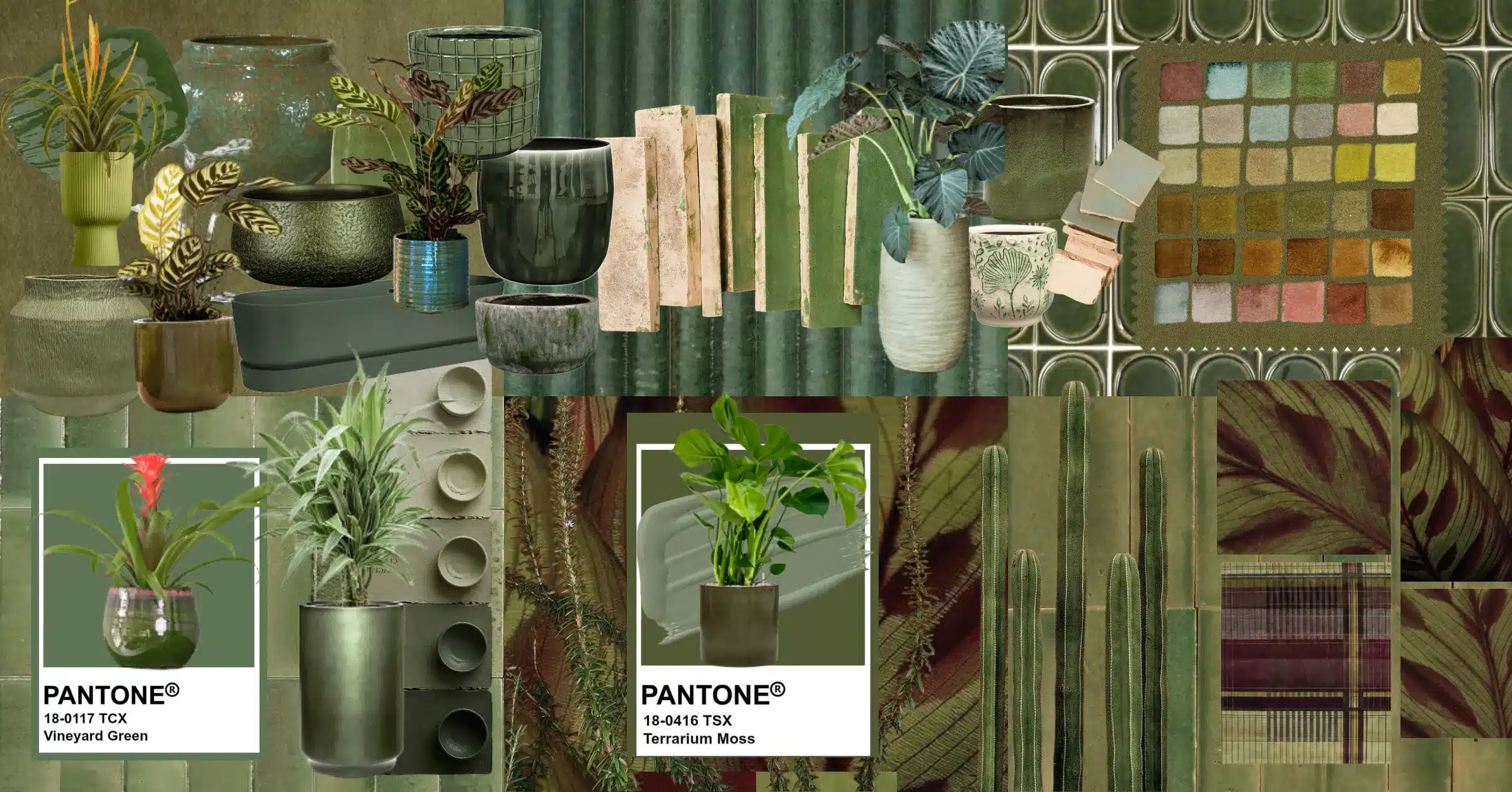
Forest green is making a comeback, and designers link it directly to biophilic design. One studio observes that as designers seek a link between the built environment and biophilic design principles, Forest emerges as a key colour direction, particularly suited to wellbeing-focused environments (fmlink).
A deep green planter is the quieter option. It echoes the plants rather than competing with them, which makes it a good fit for spas, wellness spaces and corporate environments that want calm rather than drama.
A planter is a surprisingly efficient design decision:
A few cautions apply. Bold colours need a plan, so choose one or two accent tones rather than a rainbow. Think about the planter alongside the plant, since leaf shape and colour matter. And as always, healthy plants come first. The most striking glaze won’t rescue a struggling plant, which is why ongoing maintenance matters just as much as the pot.
If you’re planning a fit-out, bring your planting partner in early. Colour, scale, plant choice and placement all work together, and it’s much easier to get right at the design stage than to retrofit. At Benholm, our team of horticulturalists and designers works with interior designers, architects and facilities teams across the UK to create planting that fits the space and the brand. Because we also design, install and maintain, the finished result stays looking as good as day one.
Planning a refresh or a new fit-out? Get a free, tailored quote and let’s talk about how planting can work in your space.
Want more ideas for bringing nature into your workplace? Subscribe to our emails for practical tips, project inspiration and the latest news from Benholm.