Skip to the content
These two colours are often synonymous with Christmas, but a growing number of interior designers are intentionally using this unlikely pair to create spaces that feel bold and unexpected.
From fiery red hues in combination with Sansevieria, classic crimson and Senecio Angel Wings, Ficus Lyrata and burgundy, to terracotta planters paired with deep olive walls, this colour combination sits opposite each other on the colour wheel which seemingly breaks the fundamental rules of colour theory… And yet, designers are increasingly embracing this unconventional clash, using juxtaposition as a tool rather than a limitation.
While red is a stimulant for energy, movement and strong emotions. Green is a calming, balanced and serene colour. This psychological interplay makes the combination compelling and when utilised correctly, they can raise the profile of a space.
For those who find such combinations too overpowering – the colour does not have to come solely from paint.
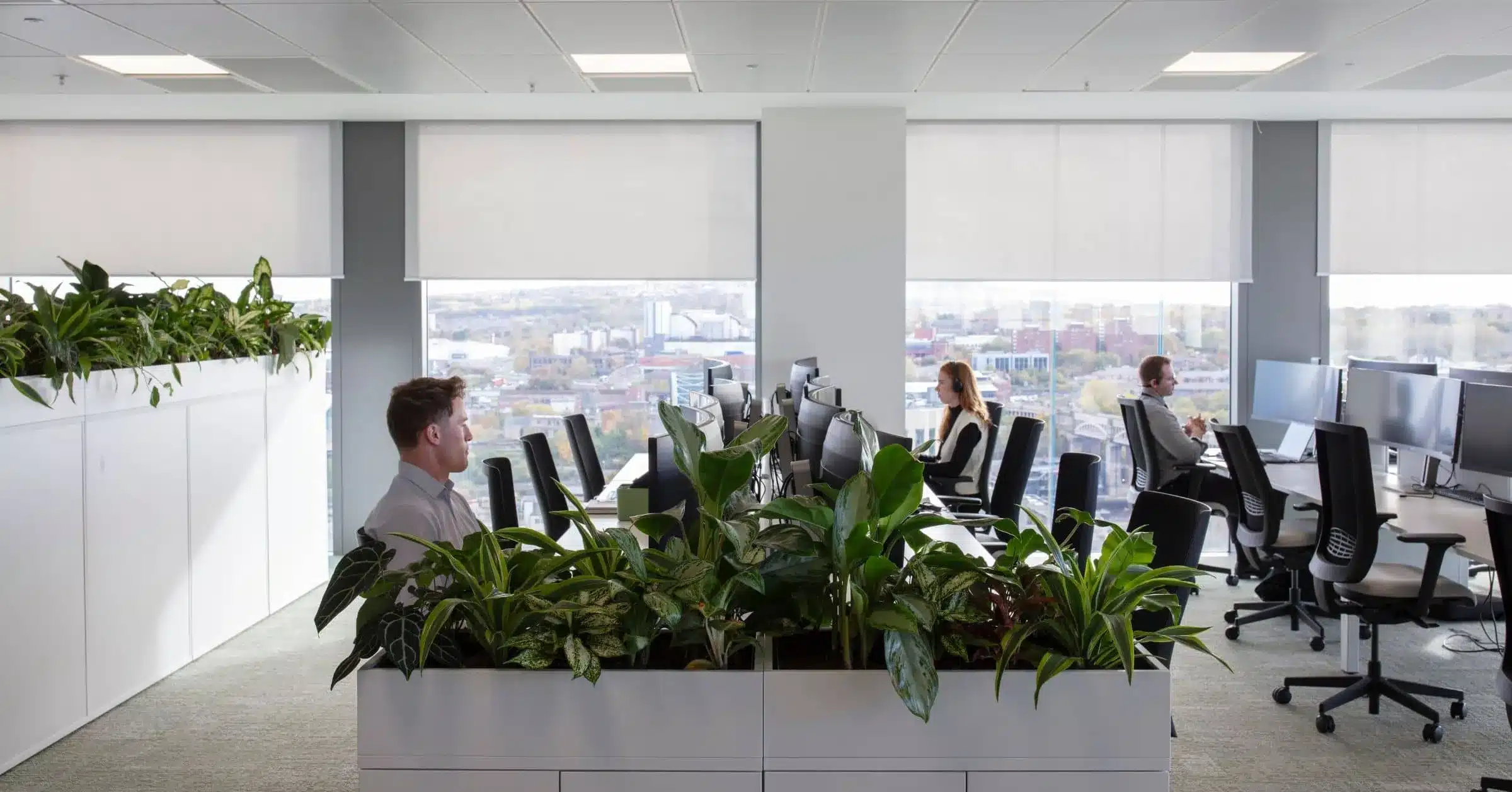
The textures, vibrancy and appeal of planting can introduce balance and cohesion without being too overwhelming. Carefully curated, layered planting schemes possess the inextricable ability to soften strong palettes while still delivering that mesmerising visual impact.
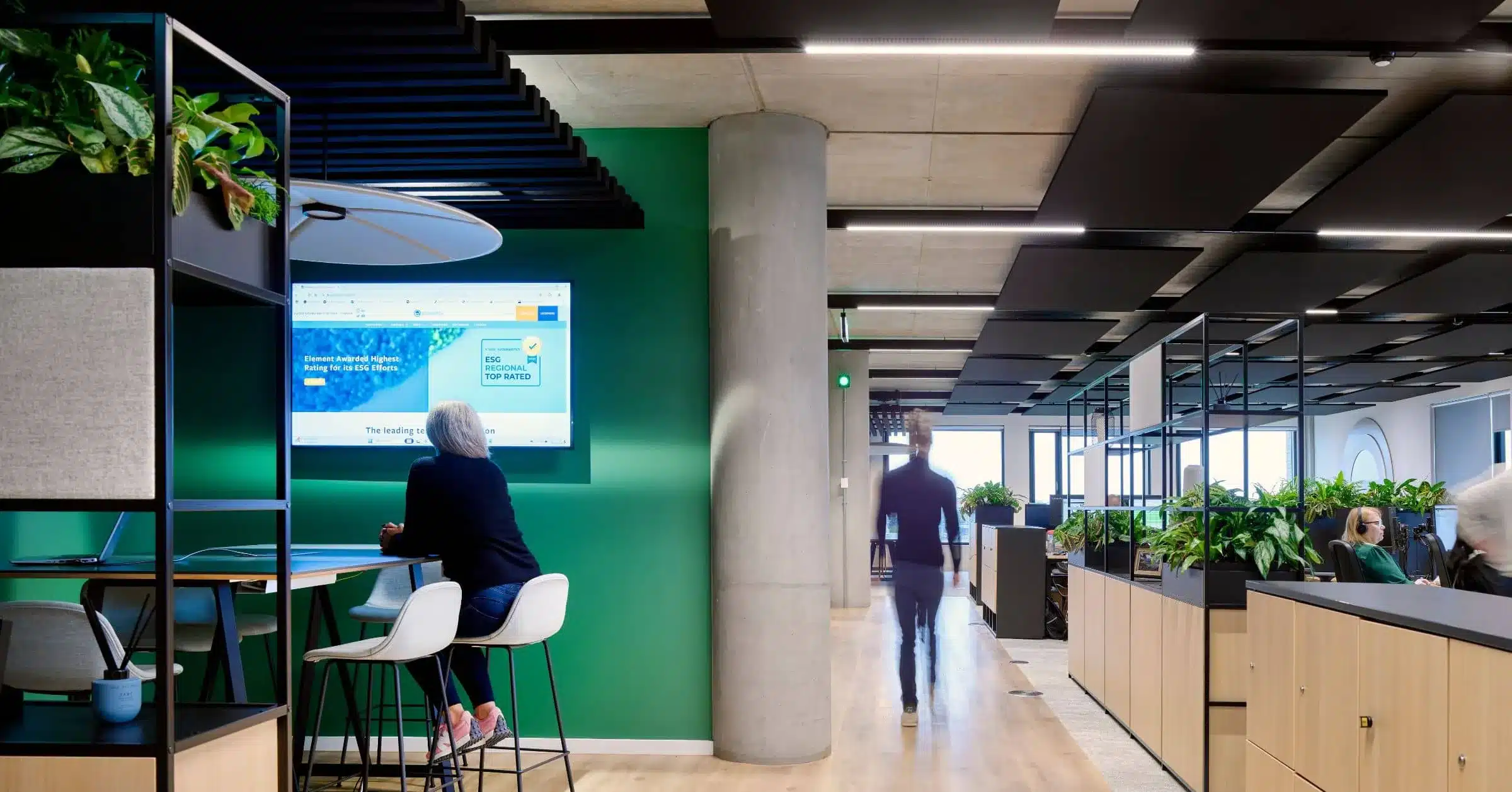
One way to make a statement without leaning too heavily on green paint is through texture-rich planting. Verdant foliage artfully scattered through either a living wall or cabinet top planters create depth and that little touch of drama while remaining organic and inviting.
This, and pairing smooth Persimmon sofas with an assortment of muted primary colours such as blue and yellow helps to ground the palette, pulling together an eclectic mix of tones into one cohesive, well-balanced interior. This is just one way to make an office or hospitality venue feel a little more like home. This colour combination also draws on playful nineties nostalgia.
Colour can be introduced in subtle yet impactful ways too. One way to achieve a well-considered look is through textured plant pots. Opting for an earthy, grounding palette can unlock a space’s full potential without relying too heavily on bold wall colours.
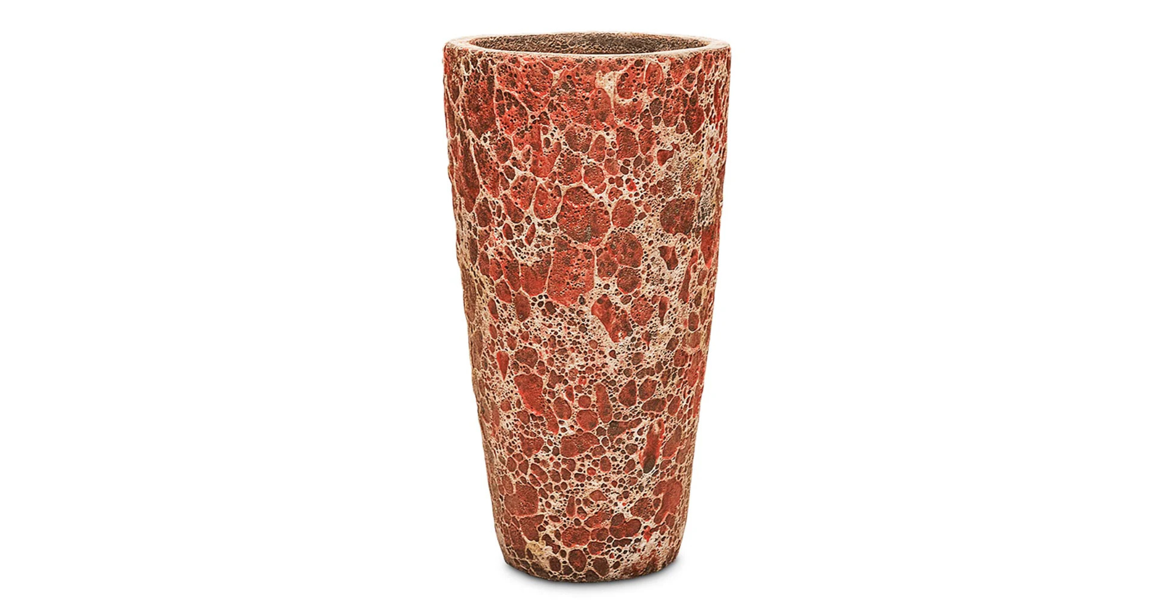
We offer Baq’s lava range of planters which makes a bold statement due to its rough texture – created by a special technique called scratch off. Handmade over a traditional wood fired oven, each product is uniquely made. The red molten rock look makes a statement against textured plants like Podocarpus Macrophyllus – creating visual impact against limestone backdrops.
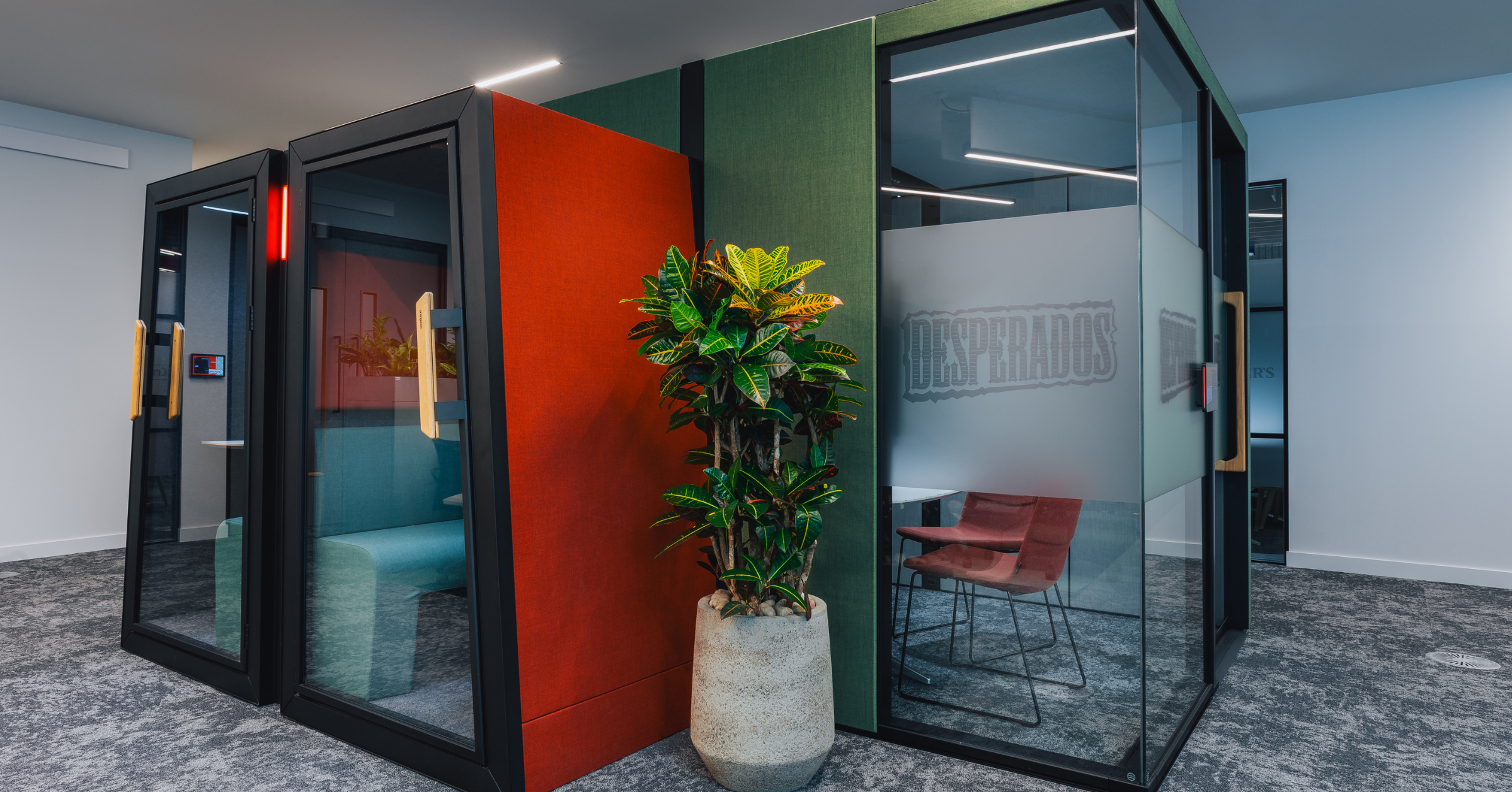
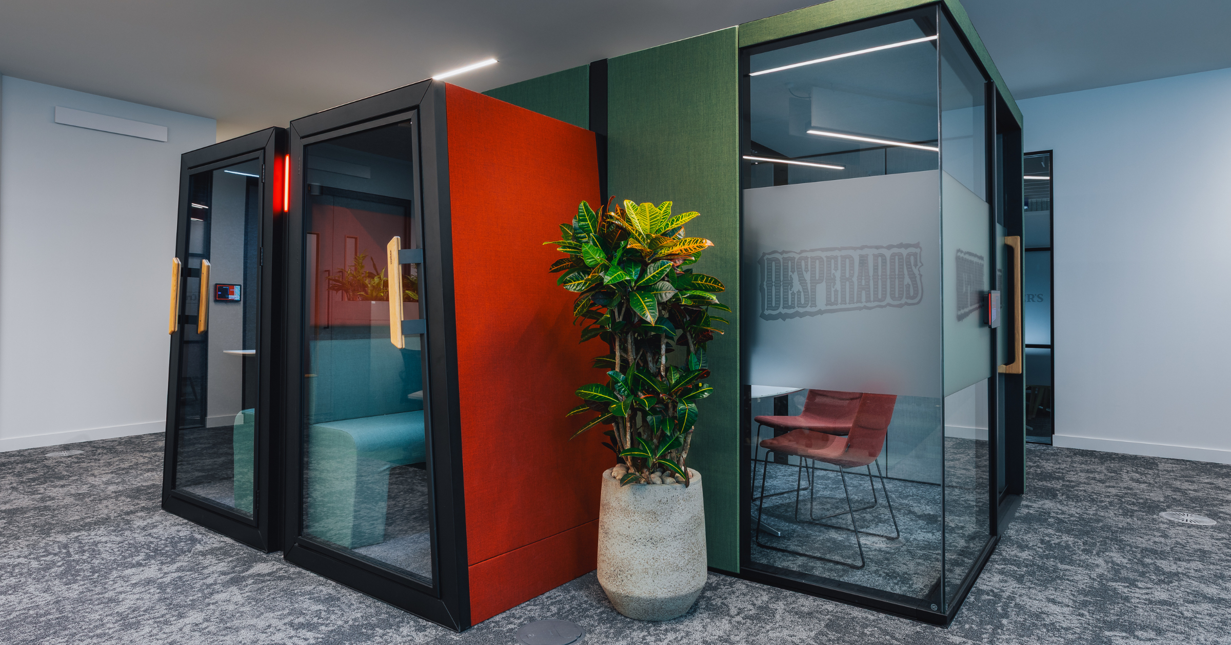
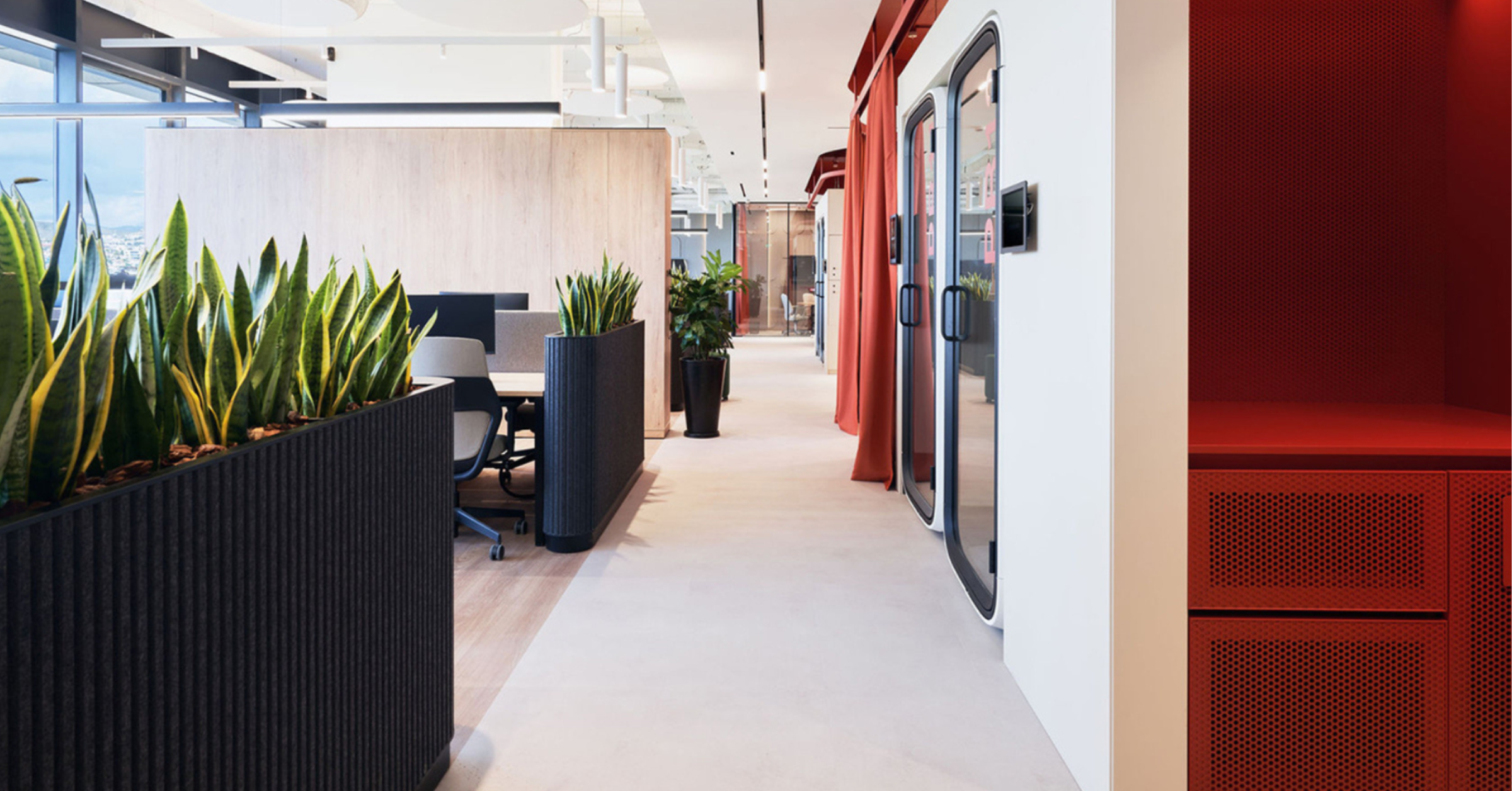
Our HEINEKEN UK project is a prime example of how red and green can work seamlessly together. In this bespoke office transformation, we responded to the architect’s brief by integrating pots to bring the contrasting red and green pods to life throughout the space.
The booths are enhanced with croton plants, these have natural splashes of red and yellow which echo the brand’s palette beautifully. A textured, grey natural pot sits perfectly between the booths, acting as a visual bridge and tying the scheme together with ease.
Natural, clay-like textures such as stone, grainy woods, soft and silky linens, and ceramics, act as neutral anchors and allow red and green to coexist without competing or becoming an eyesore. Through this thoughtful introduction of colour, planting, furniture and accessories can improve the feel of a space rather than large, painted surfaces to make them feel more layered and considered.
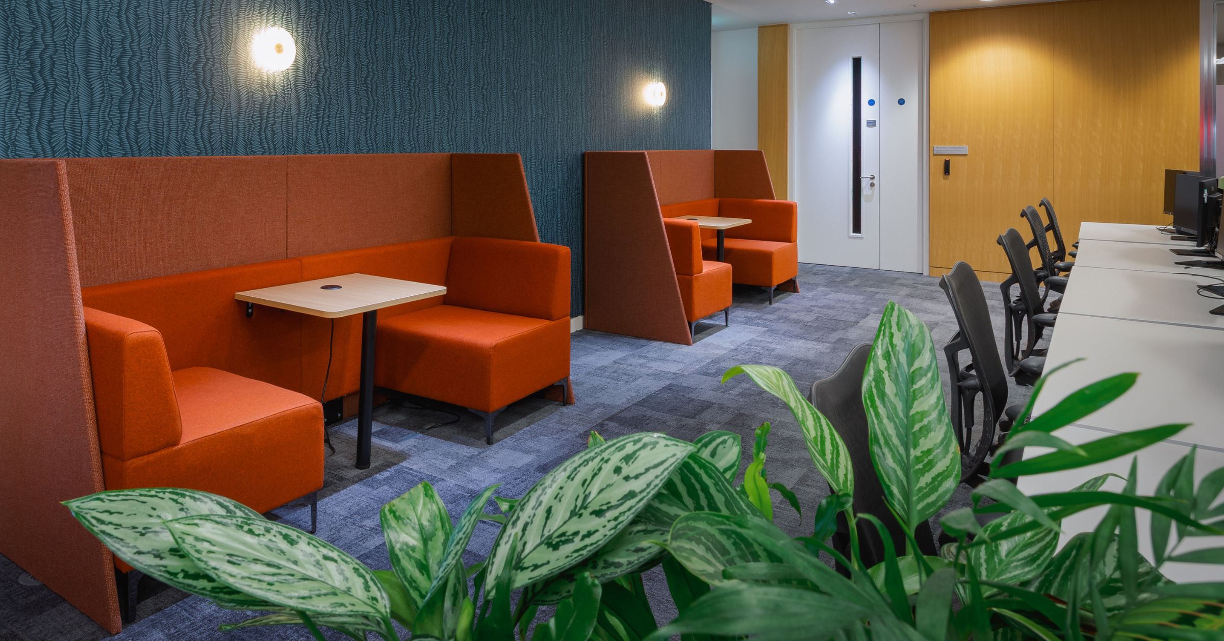
If introducing red and green feels unnatural, another option could be to use different tones of red. Oxblood, Persimmon, Sangria, Wine, Maroon and Sienna Red are just some of the wide range of colours which look amazing with touches of intentional planting. This can really add life to a space, with red providing energy and vibrant, green plants fostering a sense of calm and serenity.
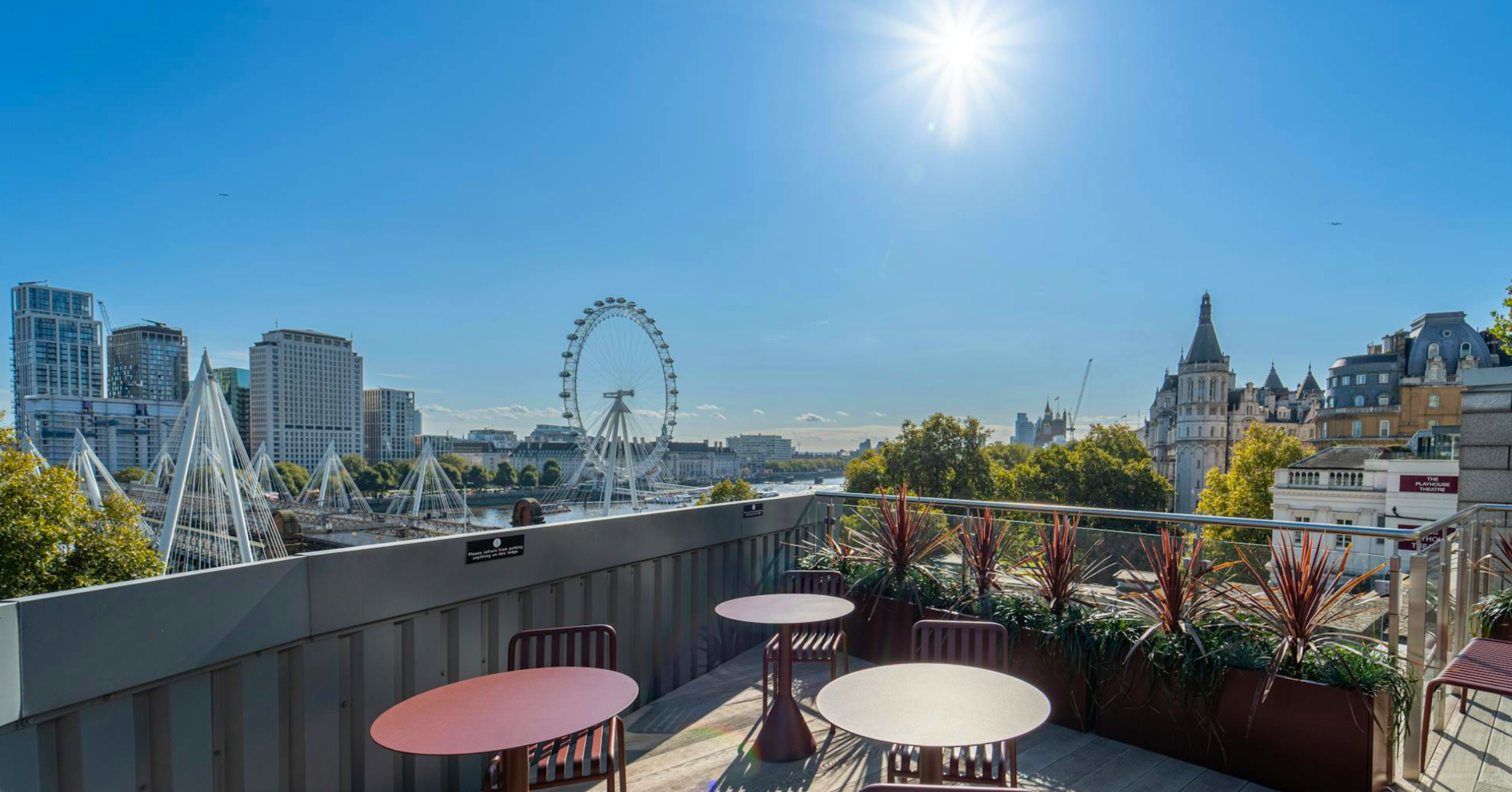
VERVE London is one shining example of using rusty red in natural cohesion with Cordyline Australis – a plant known for its striking, red, spiky foliage which contrasts well against the dense urban landscape backdrop.